COMPONENT LIBRARY
All Components
A visual reference for every body component in the GV component library. One example per component (two for components with significant toggle modes).
Content (Legacy)
This is the legacy “Content” component — a simple WYSIWYG block. Use it for one-off rich-text content. Discover what makes The Glenview at Pelican Bay Naples’ premier equity-ownership LifeCare community. Where beachfront beauty, resort-style living, and lifelong peace of mind come together.
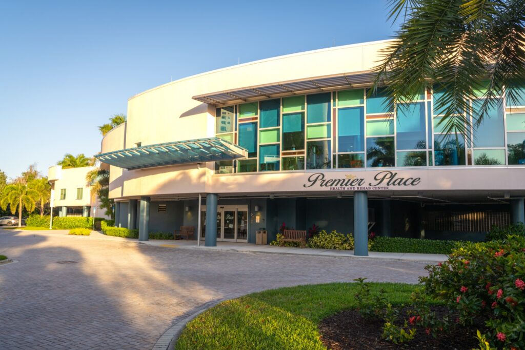
Image – Content (Legacy)
Discover what makes The Glenview at Pelican Bay Naples’ premier equity-ownership LifeCare community. Where beachfront beauty, resort-style living, and lifelong peace of mind come together.
Content Centered (Legacy)
A simple centered text block with header, subheader, and body.
Discover what makes The Glenview at Pelican Bay Naples' premier equity-ownership LifeCare community. Where beachfront beauty, resort-style living, and lifelong peace of mind come together.
Tabbed interface for grouping related content. Click a tab to reveal its content.
Each tab can have its own background color, text color, and icon.
Useful for FAQs, service categories, or program details.
GV — Video Split (Legacy)
Auto-playing video next to a text panel
The legacy version of the split video component. Newer projects should use GV — Split Video instead.
Comparison Table (Legacy)
Side-by-side comparison with highlight rows.
Other Communities
The Glenview
A highlightedCTA section.
Highlight CTA (Legacy)
Spotlight Slider with Thumbnails
Split-screen layout: large photo on left with circular thumbnails, text content on the right.
Spotlight Slider with Thumbnails
Split-screen layout: large photo on left with circular thumbnails, text content on the right.
Event List (Legacy)
06/01/2026
A list of upcoming events with date, image, and description.
Sample Event
06/15/2026
Each event entry can have its own image, title, date, and description.
EYEBROW EXAMPLE
GV — Intro Section
Centered intro section with eyebrow, headline, body text, and optional buttons. Use it to introduce a topic or section of a page.
STANDARD MODE
GV — Split Content (Image + Text)
Side-by-side image and text panel with golden-ratio or 50/50 column splits, corner-radius image, and full typography controls.

GV — Split Content (Testimonial Mode)
Testimonial mode shows a circular headshot beside a quote. Optional corporate logo can appear under the headshot.
GV — Feature Cards
Grid of cards with images, titles, descriptions, and optional buttons. 2-4 columns supported.
Card One
Each card supports an image, title, description, and optional button.

Card Two
Cards can be 2, 3, or 4 columns. Image fit can be cover or contain.

Card Three
Hover state, shadow, border radius — all configurable.
GV — Testimonial Banner. A centered quote with attribution, decorative quote mark, and optional accent color.
— Sample Attribution, Director of Sample Department
Content reveals when the title is clicked.
Each item has a title and rich-text content area.
Useful for FAQs, program details, or expandable info.
GV — Navigation Cards
Image cards with overlay text — typically used as a navigation hub linking to other pages.


GV — Banner with Callout
Full-width banner image (or video) with a floating card containing headline, body, and CTA button.
GV — Awards Banner
 CMS 5-Star
 Best Independent Living
 Gold Seal Award
Row of award badges/logos with optional labels underneath. Background can include an opacity-controlled image.
GV — Media Gallery
Lightbox gallery with configurable columns and spacing.


GV — Google Reviews
Static review cards displaying 5-star ratings, names, and text. Useful for showcasing testimonials.
Each card has a name, star rating, review text, and optional link.
Ownership vs. Renting.
It Is Not a Small Distinction.
Senior Community
Ownership LifeCare Community
WHAT THEY SAY
GV — Testimonial Slider


OUR SERVICES
GV — Icon Cards
Cards with icons (small images), titles, and short descriptions.

Icon Card One
Each card has a small icon image, title, and copy.
Icon Card Two
Useful for service categories or feature highlights.
Icon Card Three
Configurable card background and text colors.
BY THE NUMBERS
GV — Stat Highlight Cards
Large stat numbers with title and copy underneath, displayed in cards.
Years
Of excellence in senior living.
CMS Rating
For our skilled nursing care.
LifeCare
Comprehensive coverage included.
GV — Focus Area Cards
GV — Problem / Solution
Side-by-side comparison of common problems with The Glenview's solutions.
COMMON CONCERN
“Most retirement communities require giving up your independence.”
Equity ownership at The Glenview means your home is truly yours.
ANOTHER CONCERN
“Healthcare costs can become unpredictable as you age.”
LifeCare provides comprehensive coverage with predictable costs.
EXPLORE
GV — Visual Accordion
Accordion with image preview that changes as you click each item.
First Item
Second Item
Third Item
GV — Scenario Cards
Cards that present a challenge and our solution to it.
Scenario One
The Challenge
Worried about future healthcare costs?
Our Solution
LifeCare provides comprehensive coverage with predictable costs throughout your life.
Scenario Two
The Challenge
Concerned about losing independence?
Our Solution
Equity ownership means your home stays your home, on your terms.
GV — History Timeline
Founding
Vertical timeline with year, title, and rich description per entry.
Expansion
Useful for showing organizational history or milestones.
Today
Each entry alternates left/right on desktop, stacks on mobile.
GV — Team Grid
Grid of team member photos with names, credentials, roles, and bios.
Kim Dapper
BSN, RN
Director of Nursing
Bio text appears in a modal or hover state.

David Chidsey
Director of Operations
Each member has a photo, name, optional credentials, role, and bio.

Jamie Rabuano
Programs Director
Photo shape can be circle or square.
WHAT'S INCLUDED
GV — Feature List
Feature One
Two-column list of features with title + rich description.
Feature Two
No images — text-focused, great for feature comparisons.
Feature Three
Configurable as 2 or 3 columns.
Feature Four
Each item has its own title and rich-text body.
GV — Comparison Table
Modern comparison table with highlight rows and styled column 2.
✕ ✕
✓ ✓
✕ Limited
✓ Comprehensive
✕ Rare
✓ ✓
2-Panel CTA Tile
Two-panel side-by-side CTA tile with phone on the left, button on the right.
(239) 977-9744
GLENVIEW LIFE
GV — Split Slider
Image slider on one side, text panel on the other.
The text panel stays static while the image slider auto-advances. Perfect for showcasing a feature with multiple visuals.
WATCH
GV — Split Video
Video on one side, text on the other.
Supports MP4 upload or YouTube/Vimeo URL. Autoplay or click-to-play (player) modes.
SLIDE ONE
GV — Split Slider v2
SLIDE TWO
Per-Slide Text Panel
GV — 2 Column Content
Image + text in 2 columns. Image is contained (with shadow/border options), unlike Split Content which is full-bleed.
Second Column
The second column appears here. Useful for “two related ideas” or “Note for X / Note for Y” patterns.
GV — 2 Column Content (Text-Only Mode)
Two text columns side-by-side, with an optional vertical divider between them. Each column has its own headline, subheadline, body, and button.
CALL TO ACTION
GV — CTA Banner
Centered call-to-action with eyebrow, headline, body, optional kicker, and one or more buttons.
Optional kicker text below the buttons
GV — Editorial Text (Default)
Single-column editorial text with optional left accent bar on the body. Great for narrative content.
GV — Editorial Text (Split Mode)
Two-column magazine layout: headline on the left, body text on the right. The split layout works well for narrative essays where the headline serves as a sidebar anchor.
The body can include multiple paragraphs and rich formatting.